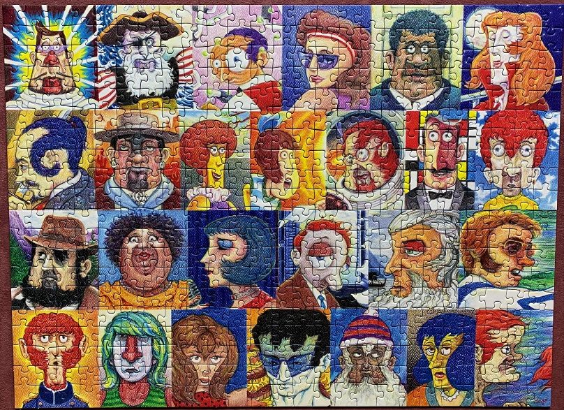
Typefaces by Hugo Maciel – Ravensburger – 500 pieces
This interesting image was much more difficult than I thought it would be, but still loads of fun! The artwork looks like it was done in crayon or something other than digital or paint. It took me a bit to get used to it, but I found the challenge intriguing and completely captivating.
It was great quality, of course, it’s a Ravensburger. The feel of the pieces, the fit, the variety in piece shapes, the image reproduction – all wonderful. I expect nothing less, and they absolutely delivered.
Typefaces is the title, because if you look at each face you’ll see that each represents a letter of the English alphabet. Sometimes it isn’t the whole face, parts of it are shaded so that only part of the face forms the letter – it’s really quite ingenious if you ask me. It took me a minute when I first looked at it to actually see the letters, and when I did of course I had to have it. Plus, it’s a collage, and you know how much I adore them.
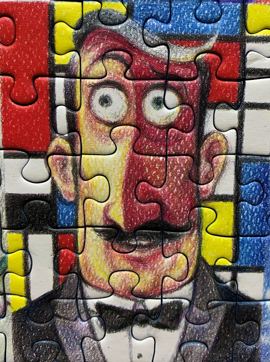
There was something about the color-blocked background in this section, I really enjoyed putting it together.
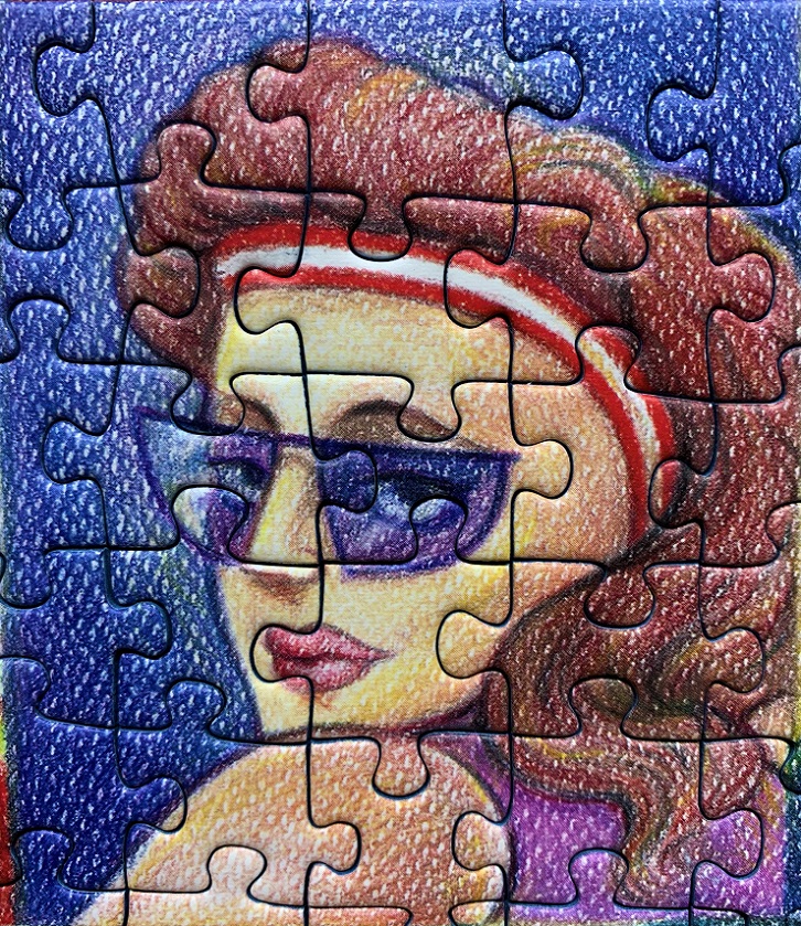
You can see how the background looks very different than the usual brush strokes or digital color. It made it more difficult at times, but sometimes difficult is fun. 😎

I didn’t see the letters until you pointed it out – quite clever!
LikeLiked by 1 person
I thought so too!
LikeLike
I remember when you posted about this puzzle a month or so ago. Great to see it completed! Lots of characters here. Today I am “O” – car won’t start, have to tow it to the dealer – OOOOOOOOOOOOOOOOOOOOO shit.
LikeLiked by 1 person
LMAO! Today I am “Q”, tired of it all and just mentally exhausted.
LikeLike
Love this one! I think the colour blocks are a nod to Dutch artist Piet Mondrian.
LikeLiked by 1 person
I love the look of it, and it’s fun to put together too.
LikeLiked by 1 person